October 02, 2026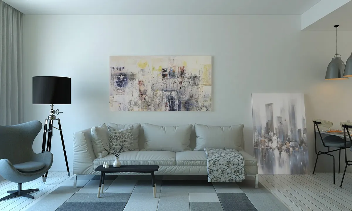
Choosing a sofa colour feels like it should be the easy part. You find a shape you like, flip through the fabric book, and pick the one that looks nicest. Then it arrives, and somehow the room looks flatter than it did before. The colour is rarely the problem on its own. The problem is the gap between the light you chose it in and the light it will actually live in.
Most of these mistakes are cheap to avoid and expensive to fix. Here are the ones that come up again and again, plus the unglamorous tests that stop them happening.
Choosing a Colour You Have Only Seen Under Shop Lighting
Showrooms are built to flatter. They are large, brightly lit from several angles, often with pale floors and high ceilings, and the fabric is usually displayed flat on a stand rather than upright in a corner. Your sitting room is smaller, darker, and lit by one window plus a lamp in the evening.
So a grey that looked crisp in the shop can turn slightly blue at home, and a warm oatmeal can read as yellow. Ask to take samples away. Most retailers either lend them or sell them for a small amount, and it is the best money you will spend on the whole purchase. Live with the sample for at least a couple of days and look at it at different times: early morning, mid-afternoon, and after dark with the lamps on. A colour has to work in all three, not just the flattering one.
Ignoring the Undertone of Your Flooring
After the walls, the floor is the largest colour surface in the room, and it quietly changes everything sitting on it. Warm oak with orange undertones, cool grey laminate, pale wool carpet and dark stained boards all pull a fabric in different directions.
A cool grey sofa on warm honey-toned wood can look slightly grubby, as though it has faded. A creamy sofa on a cool grey floor can look yellow by comparison. This is not about matching, it is about undertone. Warm with warm, cool with cool, is a reliable starting point.
To test this properly, put the sample on the floor rather than holding it up in your hand. Stand back so the flooring fills most of your view and the fabric is a small shape against it. That is much closer to how you will actually see the sofa every day.
Judging a Whole Sofa from a Postage-Stamp Swatch
Fabric behaves differently at scale. A 10cm square tells you the colour, roughly, but it tells you almost nothing about texture, weave or how much light the surface will bounce back at you across a three-seater.
Order the largest sample available, and if only small ones exist, try these workarounds:
- Borrow or buy a metre of a similar fabric in the closest tone and drape it over a chair for a week.
- Tape the small swatch to a large piece of card in a similar colour so your eye reads it as a bigger block.
- View the sample both upright against the wall and flat on the seat, because vertical and horizontal surfaces catch light differently.
- Check it under your own lamp at night, not just in daylight.
A velvet, a bouclé and a flat weave in the same colour will look like three different colours in your room. Texture matters as much as the swatch.
Trusting a Phone Screen or a Website Photo
Screens are tuned for impact, not accuracy. They push contrast and saturation, and a photograph taken in a styled room with props, fresh flowers and a bright window will read nothing like your own space. A dark green can look almost black on one device and grey-green on another.
If you are ordering online, always request a posted physical sample first, even if it adds a week to the process. If samples genuinely are not available, choose a mid-tone neutral rather than an extreme. Pale and very dark colours are the hardest to judge from a screen and the hardest to live with if you get them slightly wrong.
Forgetting the Fixed Colours in the Room
Walls are the obvious one, but they are only part of the picture. Skirting boards and door frames, window surrounds, a fireplace, built-in shelving, curtains and a rug all sit in the same view as the sofa. Each one adds a colour note, and a sofa that clashes with two of them will never settle.
A useful trick is to photograph the room with the sample resting on the sofa position, then look at the picture with the colour drained out. In black and white you stop noticing hue and start noticing value, which is how light or dark the sofa is against its surroundings. If everything comes out the same shade of grey, the room will feel flat. Decide whether you want the sofa to recede into the background or stand out, then choose accordingly.
If the shape is doing the work, calm the colour. If the colour is doing the work, keep the shape simple.
Letting the Trend Decide, or Playing It Too Safe
Trend colours are not a mistake in themselves, but buying a whole sofa around one is a long commitment to a short moment. The trick is to ask a blunt question: would I still like this in five years, with different cushions, a different rug and a different wall colour? If the answer is no, put the trend in the accessories and keep the sofa in a tone you trust.
Playing it too safe has its own cost. A greige chosen to offend nobody often ends up looking slightly lifeless, particularly in a north-facing room where the light is already cool. If you want a colour with some depth, a mid-tone is usually a kinder bet than a pale one, because it holds its shape visually and hides everyday marks better.
Overlooking How the Colour Ages With Real Life
A sofa does not stay pristine, and the colour you choose decides how gracefully it wears. Pale linen and a muddy dog are a difficult pairing. Light grey linen and dark denim will pick up dye transfer on the seat over time. Very dark colours show dust and cat hair, very pale ones show everything else.
Give some thought to the traffic in your home before you commit. If children, pets or frequent guests are part of daily life, a slightly darker mid-tone, a textured weave or a fabric with a removable, washable cover will look better for longer. Ask to see the care instructions before you order, not after, and check whether covers can be replaced individually if one cushion takes the worst of it. Sunlight fades fabric too, so note which side of the room gets the strongest light and how the sample behaves after a few days taped to that window.
A Simple Test Before You Order
Run through this in one evening and you will avoid most regret later:
- Get a large sample, or the largest one available, and take it home.
- Place it where the sofa will actually sit, upright and flat.
- Look at it at three times of day, with the lamps on for the last one.
- Put it on the floor to check it against the undertone of your flooring.
- Drape it over an existing chair to see it at full size.
- Photograph the room and check the black-and-white version for value contrast.
- Check the care instructions and how your household actually lives.
Then wait a week. If you still like it in seven days of ordinary light, it is almost certainly the right choice.
Photo: Pexels / Pixabay